/
Designed and rolled out a reusable model for ordering and managing cloud services, replacing fragmented service-specific flows with one shared pattern.
I owned the project end-to-end. The pattern is adopted in 5 products.
Role
UX / Product Designer
(owned the pattern end-to-end)
Company
One of the largest independent cloud providers in the region: IaaS, dedicated servers, managed Kubernetes, security and AI products inside one control panel.
Team
Cross-functional: backend platform team, product managers, fellow designers, engineers

Context
Control panel of the cloud infrastructure provider offers dozens of services across very different domains — compute, storage, networking, security, AI. For 15 years each had grown its own way of being presented, ordered, provisioned and managed. For users, the same action felt different from one service to the next. For teams, every new service meant reinventing flows from scratch.
Problem
No shared standard and high uncertainty while handling a simple business entity. Ordering flows were fragmented across services, responsibilities overlapped between teams, and there was no single source of truth for "how a service should behave in the panel." The cost landed on both sides: a confusing experience for users, and slow, duplicated work for designers, managers and engineers.
Process
1
Research
I audited every existing way services are presented and ordered across the panel, mapping the variations in an excel sheet.
2
Concept
Designed a single pattern — from how a service appears in navigation to unified flows for ordering and managing it.
3
Align
Tested the concept with the team that owns the services backend and with product teams as domain experts.
4
Present & iterate
Ran an internal presentation for designers and PMs, gathered feedback, and refined the pattern.
5
Enable
Wrote documentation and shipped ready-made templates so everyone could self-serve.
Solution
In the control panel, services are auxiliary entities. The main work is carried out with resources: virtual machines, S3 buckets, Kubernetes clusters, networks. Services, on the other hand, exist as an element of the infrastructure that the user only orders and pays for.
I proposed a definition that we agreed on with the team: a service is an infrastructure object whose lifecycle in the panel is limited to ordering and payment, and nothing more. This is where the need for a pattern‑template comes from: it allowed designers and engineers to avoid spending effort on solving a task that is secondary for the business.
The pattern consists of three elements: a page for selecting available services, a modal window for placing an order, and a component for displaying connected (active) services.
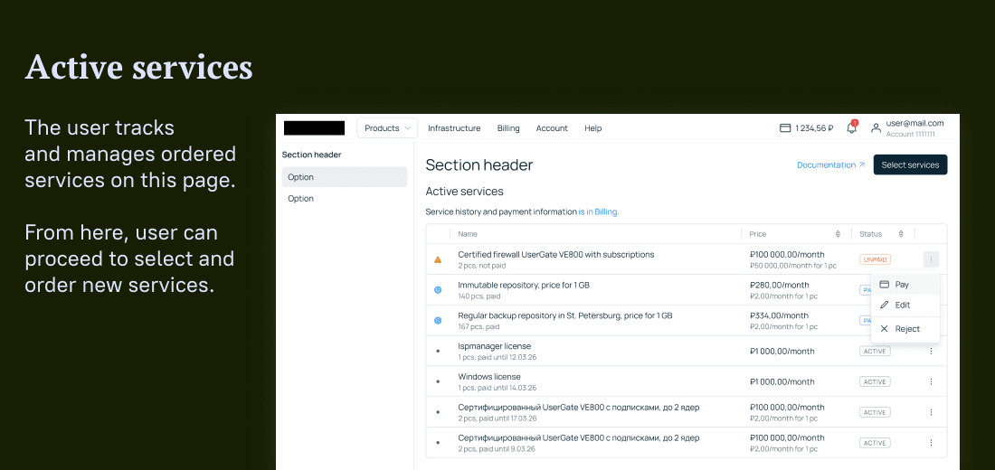


I have described the scenarios and parameters that determine the use of these elements: the type of service, the level of automation, and the amount of information required by the client at the time of placing an order. Here are two examples of how a parameter affects the design:
Level of automation
This is a conscious trade‑off. For the MVP, we maintain a manual order process (the manager processes the request and sets up the service) so as not to create an automation system until the workload justifies such costs. If manual processing becomes inefficient, the process needs to be automated: the payment is deducted, and the order is processed without human involvement. In the pattern, this changes specific details: the microcopy on the buttons, in the modal window (order vs. pay), the display of the price and components of the billing system, as well as the presence or absence of a notification that a manager will contact the client.
The amount of information required when placing an order
We adapt it to the specific service. If the choice requires explanations — for example, when there are several groups of services with significantly different rates — the explanatory information is placed directly in the list of services. If the service is intuitive or intended for a narrow niche, we provide a link to detailed documentation so as not to overload the interface with unnecessary details.

The pattern is made to serve three audiences:
Product managers
Get documentation on when and how to apply it
Engineers
Get ready-made components and documentation
The same service now looks and behaves consistently everywhere it appears — in navigation, ordering, and day-to-day management.
Result
- Replaced fragmented, service-by-service flows with one reusable pattern: docs & Figma templates
- Adopted across 5 products: teams build new services on the template instead of from scratch.
- Launching a service to test is faster, and the experience stays consistent for users everywhere it appears.
What this case shows
Systems thinking
I design future-proof patterns, that cover many cases in advance.
Cross-functional leadership
I aligned backend, product and design around one standard.
Design that ships
Docs, templates and components others actually reuse.
contacts
I'm open to UX / product design roles