/
An eye-tracking study comparing how much mental effort different cloud-provider consoles demand — measuring cognitive load objectively, rather than inferring it from self-report.
Read the thesis
Role
End-to end, solo
→ framed research question
→ designed both prototypes
→ implemented eyetracking platform (AI-assisted)
→ did quantitative and qualitative analysis
Context
MSc thesis, HSE University · UX Analytics & Information Systems Design
Methods
Eye-tracking, cognitive-load measurement, comparative analysis
Context
Cloud consoles are some of the densest interfaces people use daily.
"This layout is hard to use" is a claim designers make constantly — and almost never prove. For my thesis I asked whether we can measure how much mental effort an interface actually costs, and see exactly where the load spikes.
Problem
Cognitive load is invisible in a normal usability test — you see that users struggle, but not precisely where or why. I wanted an objective signal, not just self-report.


Process
1
Research design
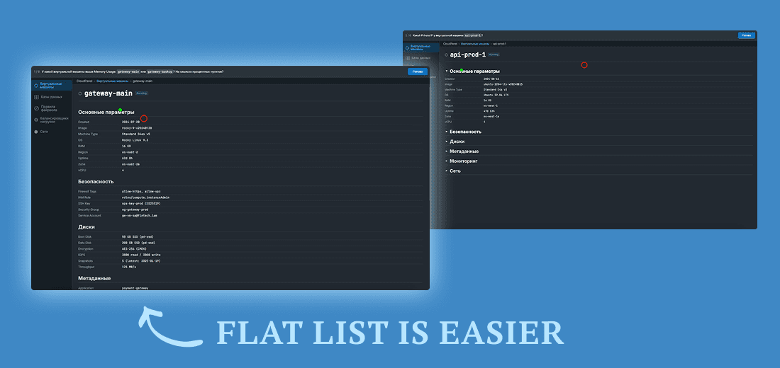
Designed a comparative study across cloud-provider console interfaces, isolating a single UX pattern — flat list vs progressive disclosure — so the effect wouldn't be confounded with other differences.
2
Platform execution
Built the full research platform solo: synchronised eye-tracker, screen, and behavioural recording on one timeline; a pupil-signal cleaning pipeline and a metrics + stats library.
3
Data collection
10 infrastructure professionals interacted with 2 live alternative prototypes, doing compute management tasks. Gaze, pupil, behaviour, NASA-TLX, and interviews in one 40-min session.
4
Analysis
Paired non-parametric tests with multiple-comparison correction, plus thematic analysis of interviews — quantitative and qualitative triangulated.
5
Recommendations
Translated findings into design-relevant recommendations: flat list is better when managing cloud resources.


A textbook usability heuristic gave no benefit to experts —
flat layout actually won
Progressive disclosure — a textbook usability heuristic — gave no robust cognitive load benefit for expert users. On fast-search tasks, the flat layout actually won. Both the eye-tracking trends and the interviews pointed the same way. This lines up with the expertise-reversal effect: what helps novices can slow experts down.
By the numbers
10
infrastructure professionals (system admins, DevOps, backend & ML engineers)
5
data channels captured per session: gaze, pupil, behaviour, NASA-TLX, interviews
1
research platform, built end-to-end and solo
40 min
for one full session (of 10), from calibration to interview
Result
Made cognitive load measurable and comparable across realistic console interfaces — turning "this feels confusing" into a signal you can point to.
Produced a result that runs against a common UX heuristic, backed by converging quantitative and qualitative evidence.
Flagged the confounders I couldn't fully control — screen brightness and task difficulty — and marked the pupil results as exploratory rather than overclaiming. Honest measurement means knowing the limits of your instrument.
What this case shows
End-to-end and technical
I designed the study and built the platform that ran it, solo.
From evidence to design
Psychological constructs, measured objectively, feeding straight into interface decisions.
Research honesty
I know what my instruments can and can't prove.
contacts
I'm open to UX / product design roles